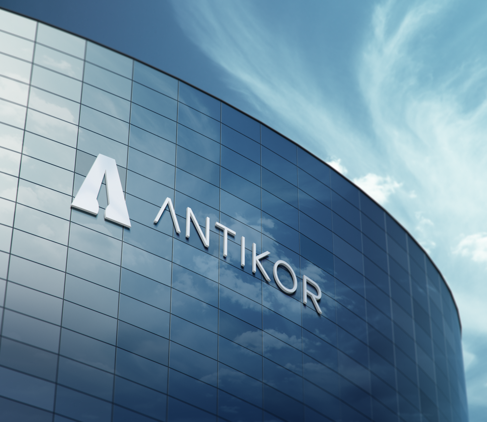
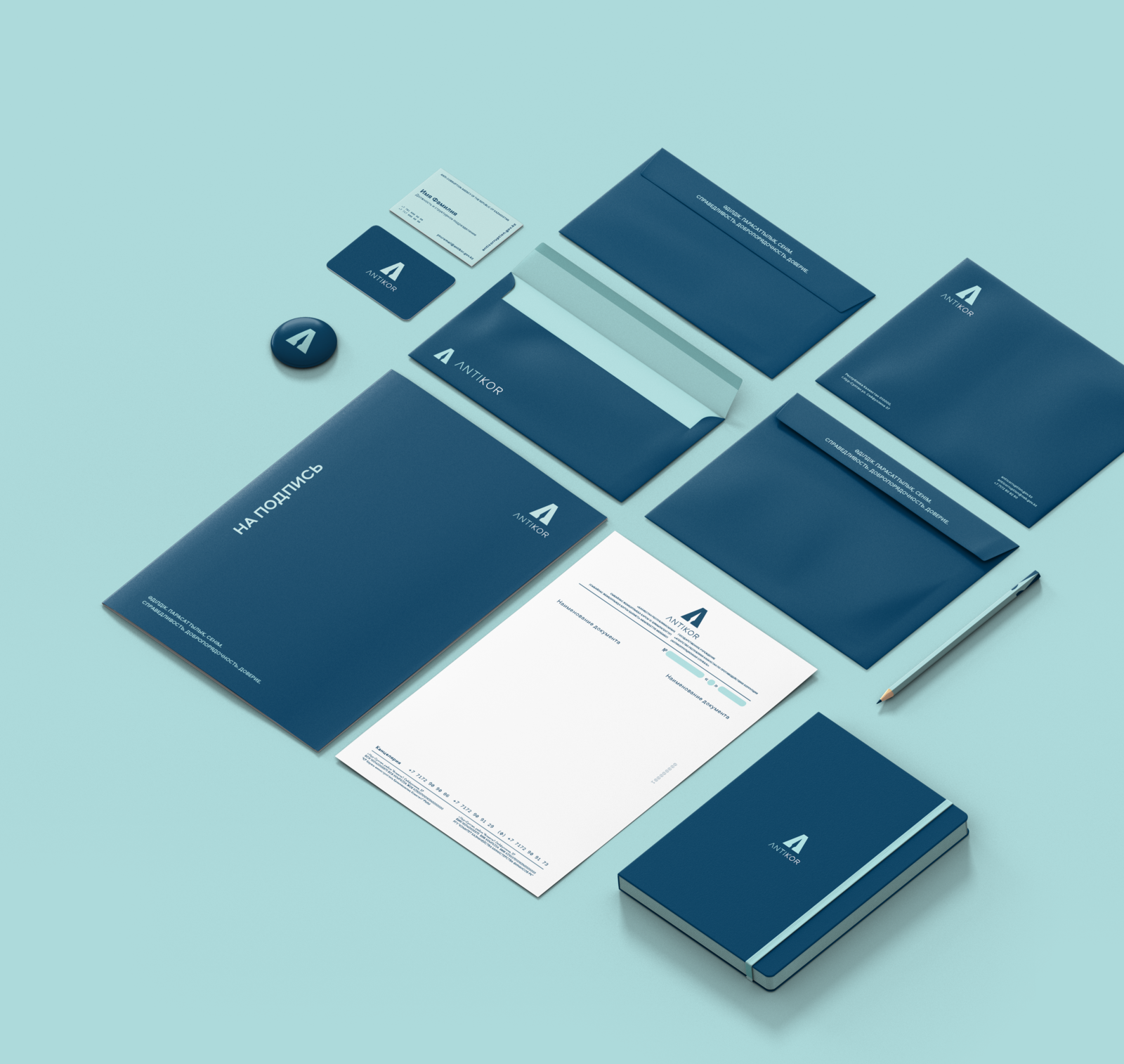
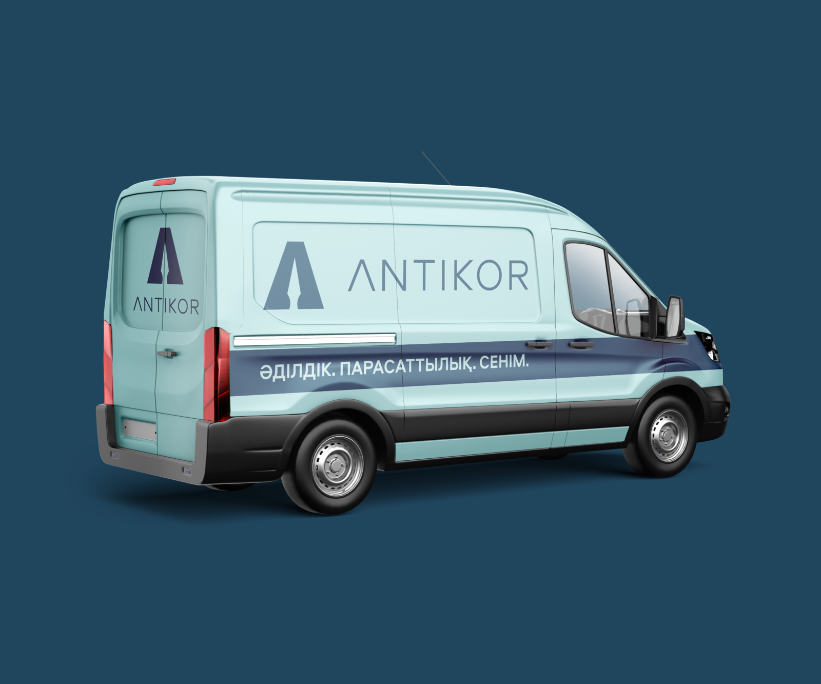
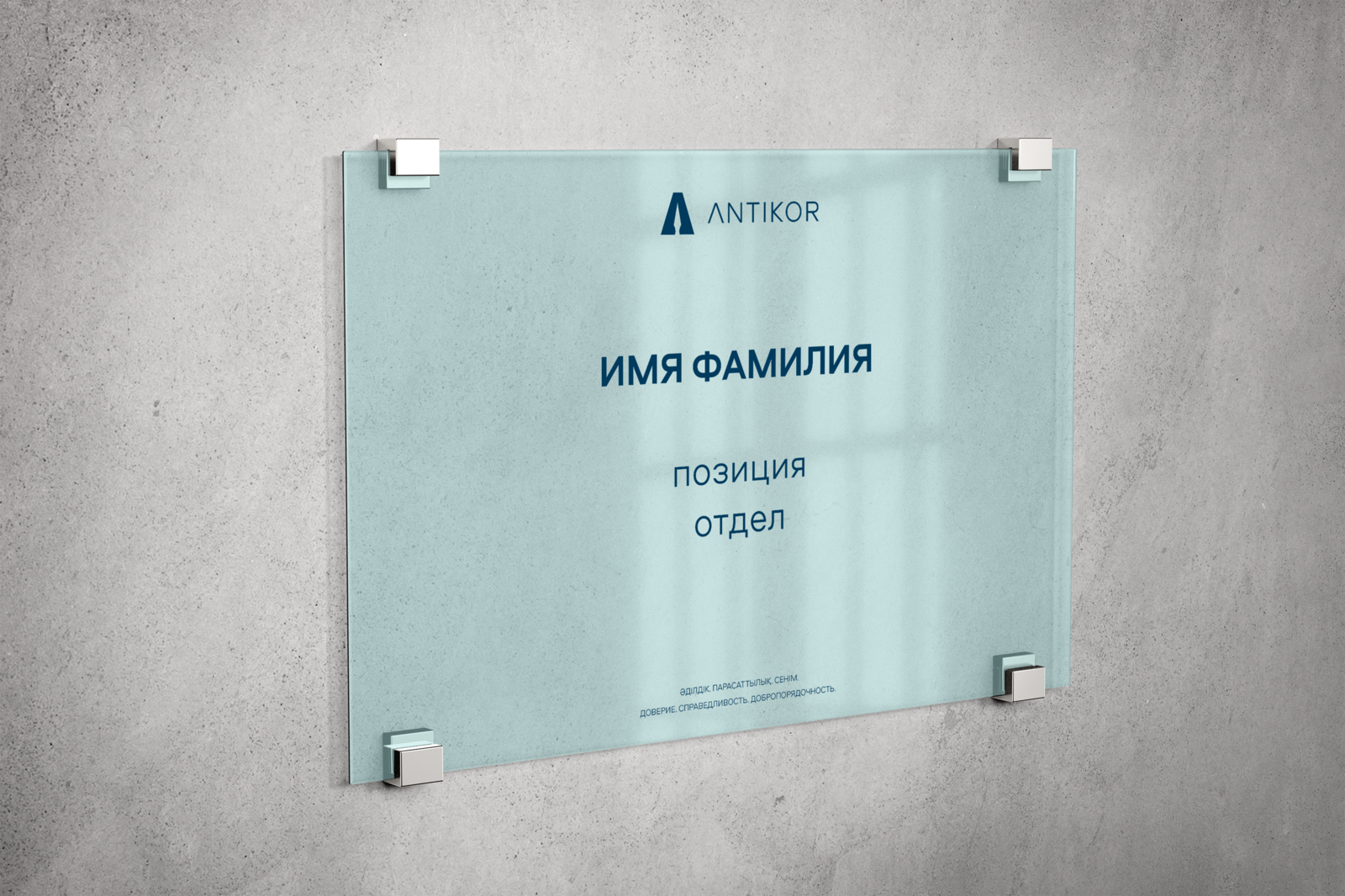
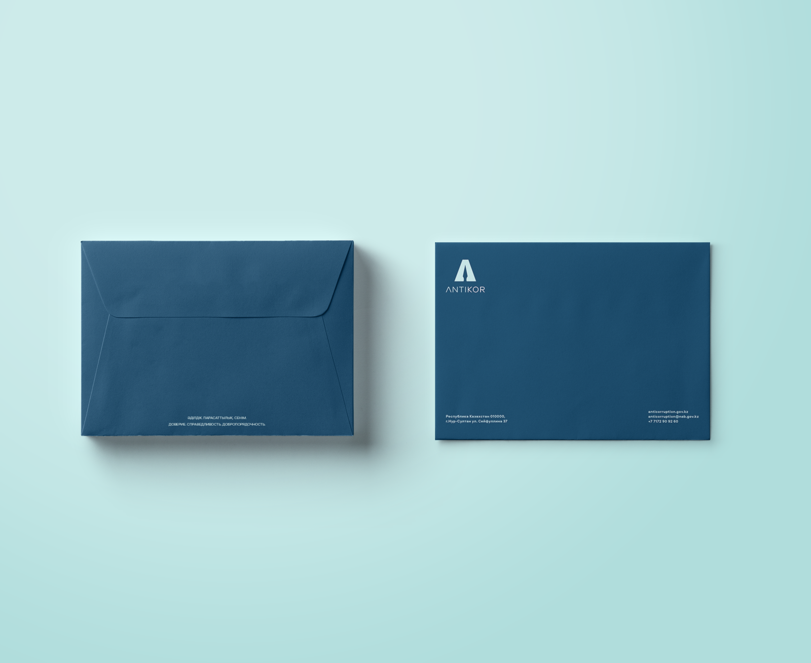
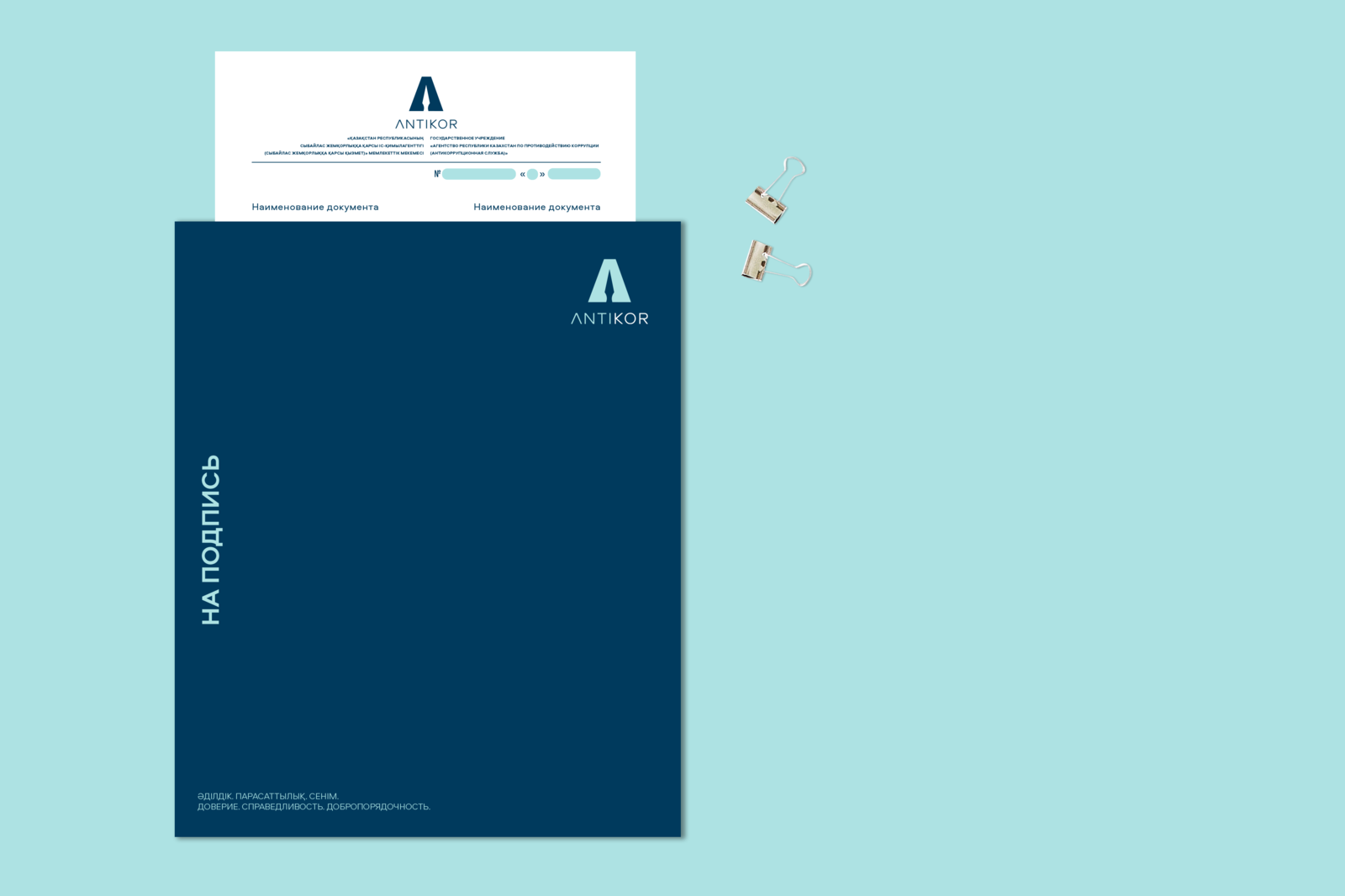
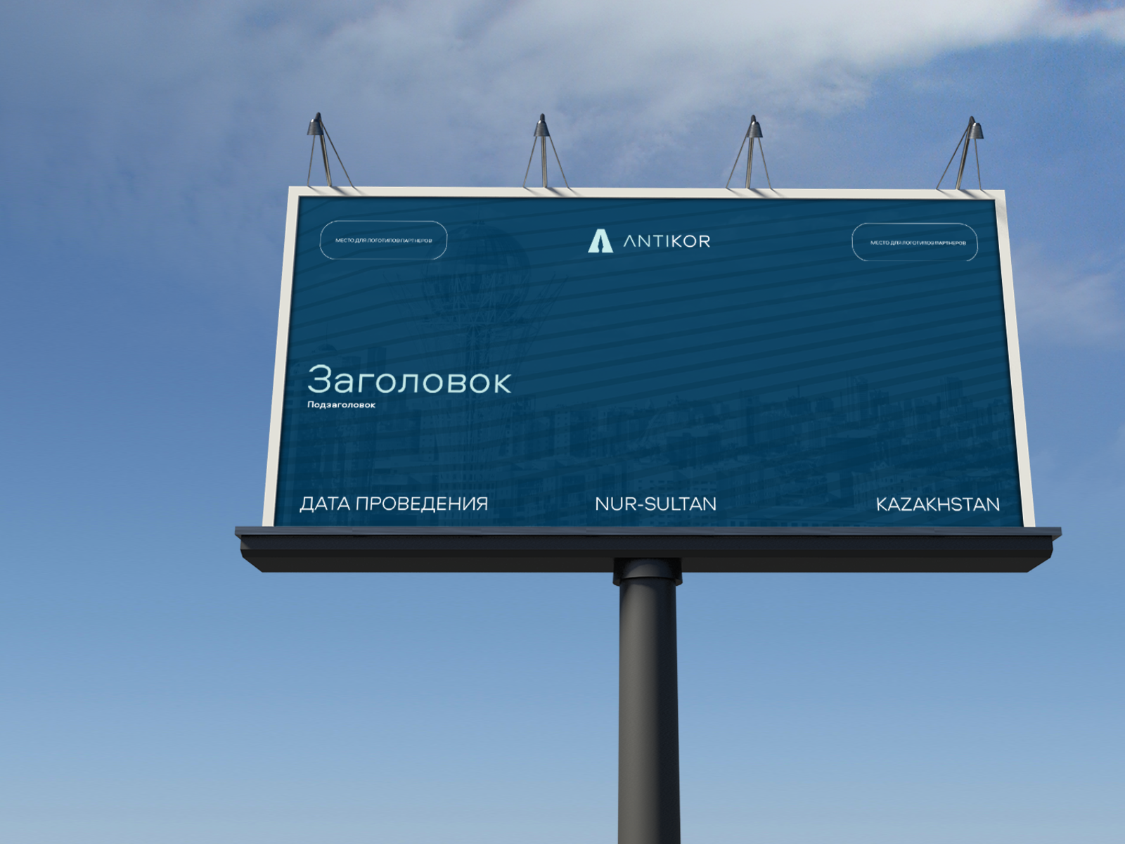
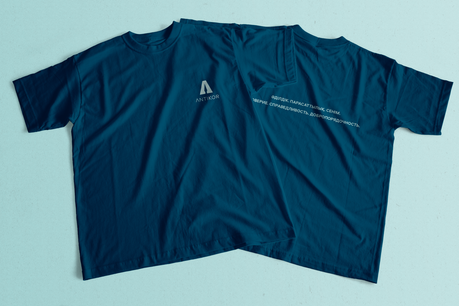
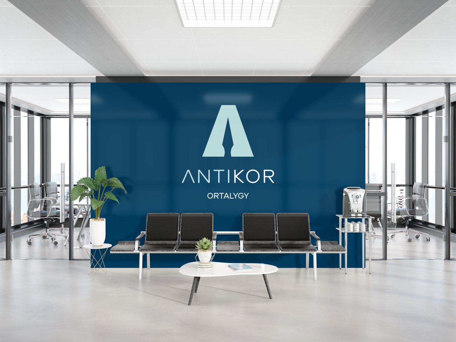
Brave new and fresh identity, that doesn’t use cliches.
Problem
According to the new policy of Anti-Corruption Agency of the Republic of Kazakhstan and the policy of The listening state – Anti-Corruption Agency was in the process of changing its perception from aggressive and punishment to preventive and motivational institution and the brand identity was the instrument to strengthen the process.Challenge: Revolutionize the visual identity of classical governmental institution and introduction of the progressive brand identity
Most of the government agencies’ communication products look much alike, they usually include elements of national patterns and it is difficult to distinguish one from the other. However, the effectiveness of the logo depends on how recognisable it is and how easily adaptable it is to print and digital formats.
Fresh way
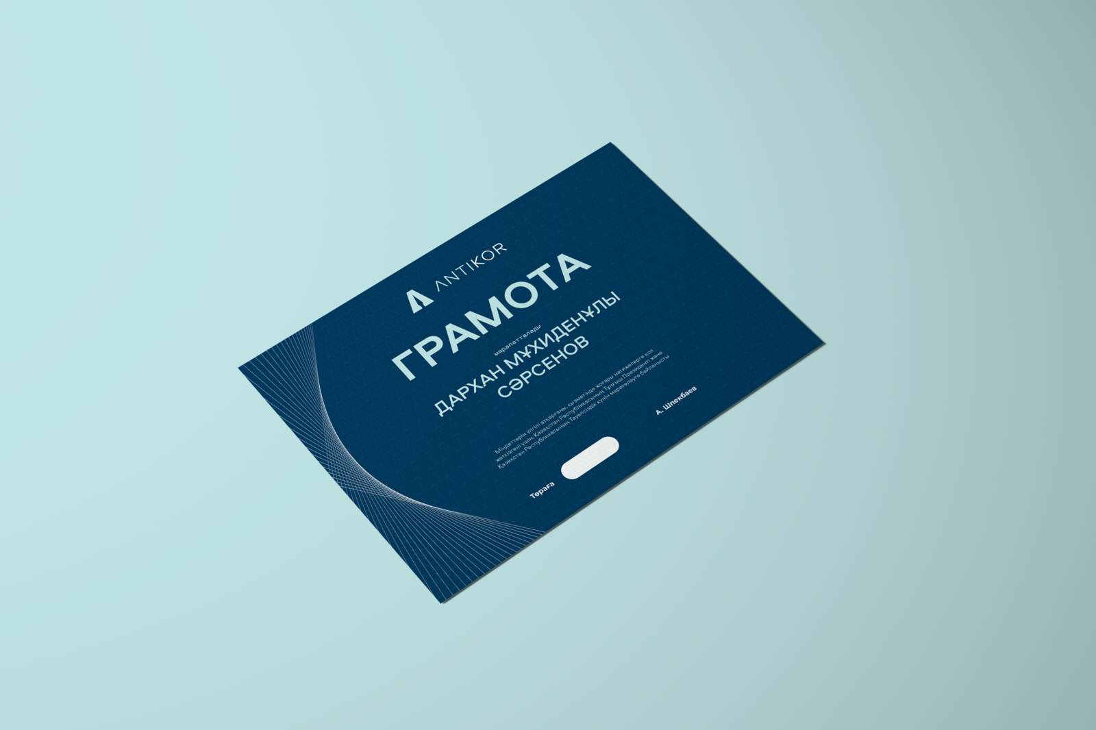
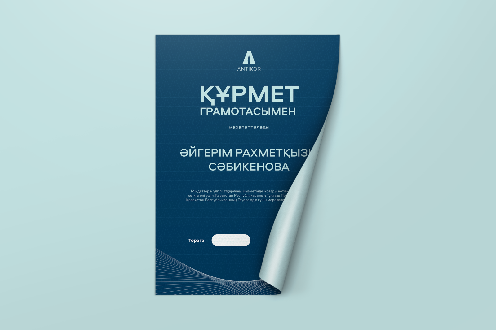
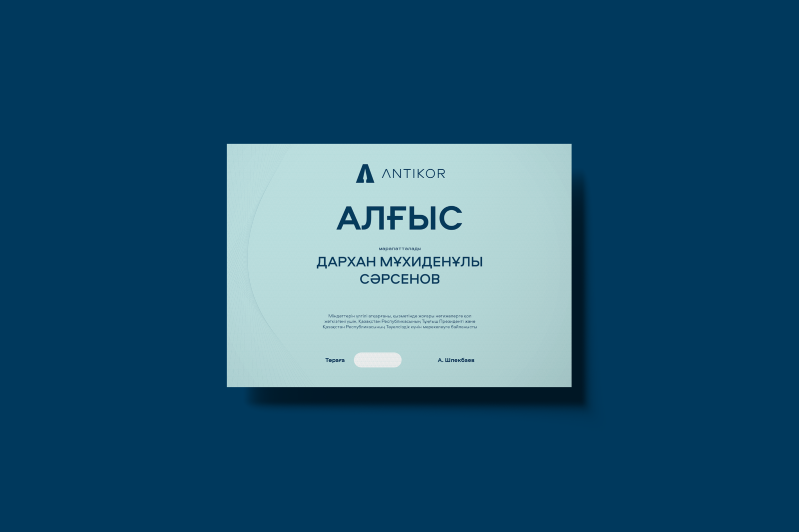
We designed and proposed a complete new and fresh identity, that doesn’t use cliches
Shorten the name
Antikor is a shortened agency name. Most of people use this shorten name for effective communication
Metaphors
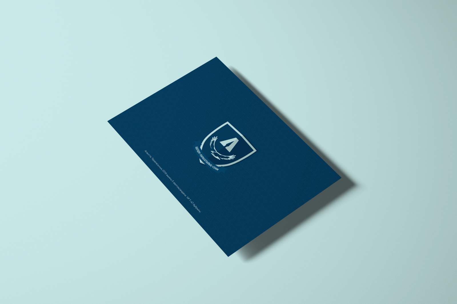
The logo depicts the letter A, a spear, which stands for a weapon used by warriors metaphorically suggesting the function of the Anti-Corruption Agency as a law enforcement that protects the interests of the citizens, and the agency name. Also adding the new value of the agency - with an accent on PREVENTIVE function - logo picture the pen - that can also punish.
